With respect to the two works on paper; while ‘colourful’ they are in retrospect unsatisfactory when compared to others with a better relationship of elements, and I fear they are too murky and ‘mute’. In respect of your comments on the painting “Investigation of an idea…”, I’m reworking it to tighten the composition.
I went back to my tapestries and art photos, and considered your suggestion to be more dimensional. I spent some time experimenting. I made some colour cards and considered how this might work, based on David Hume’s ‘missing shade of blue’ problem on how we perceive a gap in a continuum of colours (a bit like the link you provided, but I’ve tried to ‘abstractify’ it). Broadly, not pleased with the results but have included the process in the Journal notes for this period. I’d welcome further thoughts on dimensionality.
I also wonder about scale; I have a great big roll of canvas and I’m keen to paint on the unstretched canvas and hang the paintings more like tapestries (a la Frankenthaler and unprimed canvas). I find it odd to conceal the canvas texture; with paper and wood panels I integrate the surface texture into the painting. Any thoughts on this?
Experimentation
The mentor made suggestions about dimensionality and working paper differently. I tested this out in an experimental sequence, beginning with simple layering of torn paper, to cut cards, applied as suggested as ‘paint marks’. These are fun to do but were not satisfyingly expressive.
Need to think about whether this is a direction I want to mine further.

Exp 1: Torn and layered Xuan paper. Japanese black ink and acrylic red ink. ~40 cm x~50 cm x~1 cm 
Exp 2: Exploring colour layering. Japanese watercolour on Xuan paper. ~20 cm x~20 cm x~4 cm 
Exp 3: Torn Xuan paper, Japanese watercolour; glued down, raised ridge down the middle. 30 cm x 40 cm 
Exp 4: painted cut paper to interpret ‘missing shade of blue’, 30 cm x 30 cm 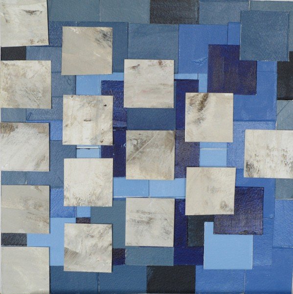
Exp 5, with additional layer, 30 cm x 30 cm 
Exp 6. Final experiment, paper, oiled paper overlays, acrylic. 30 cm x 30 cm
Reflection
I found the suggestion to alter the shape of the paper interesting. I have tended to use full sheets of paper and have done work that is differently shaped such as vertical ‘landscapes’. I did a series of paintings on paper that were folded vertically and designed to fit into the corners of rooms – corner art – but framers had a fit.
The comments also made me think of the film “Off the map”, which features a 40 foot long watercolour (Stan Berning in New Mexico did the painting). The film intrigued me to think of a painting emerging as a whole over time; I did a painting a month for a year in a bound book of handmade paper, telling a ‘story’ over the course of that year, with fabricated lettering (bit like the Voynich manuscript).
One of my early explorations was with torn paper, and I have thought how to blend paper and tapestry technique. I did a series based on Fibonacci ratios, and used that to build up layers of images. This was an early exploration of tapestry-type approaches to the painted surface. Here are some examples.

Fibonnaci 1 (sold) 
Fibonacci 5 
Fibonacci 6
With tapestry, I have done free form shapes (Breastplate), and object-as-loom (Adz). I find it interesting that paintings are done on a woven cloth surface that the artist often goes to great lengths to make invisible, so I took one of Kelly’s paintings and embedded it in a fabric/tapestry structure. (The Idea). Tapestry was enjoyable but tough on the back and even with two looms on the go it was very slow…..

Breast plate, wool, silk metal armature
~30 cm x ~30 cm
Adz (tool fragment), wool, cotton, watercolour, wood, metal, ~15 cm x ~15 cm 
The Idea (with embedded interpretation of Kelly, “Red, Yellow, Blue”), wool, cotton, ~60 cm x~100 cm