The following material reflects a voyage of discovery facilitated by my experience doing art photography. Working with a creativity coach, I developed this resource material to help be in my abstraction journey.
These are in sections, reflecting different possible sources of inspiration:
- the built environment
- light and shadow
- natural forms
- perspective
- rhythm
- sky
- unusual
- up close
- whole images
I have also included exercises to try yourself so you can put this material to use in your own work.
1. Built Environment Abstractions
The built environment, the buildings and people and the office, and factory can become an amazing creative resource, full of details and colour, patterns, shapes, and lines. Images can often be quite ordinary, but taken as a whole, they provide a fresh perspective, and open a new way to explore of shapes and colour.
The beach scene illustrates the sense of shape and colour that people make on a beach, which is almost alive, as each time you look things have moved, the colours and patterns the people make always changing.


The picture of Marseilles is taken from a very high vantage point. Again, detail is largely lost and the colours are washed out by the noon sun. But that same sun has revealed some dark canyons of roads curving through the city. Copying this scene might be quite time-consuming, but extracting from it the shapes and flow of the city itself can be a real delight.
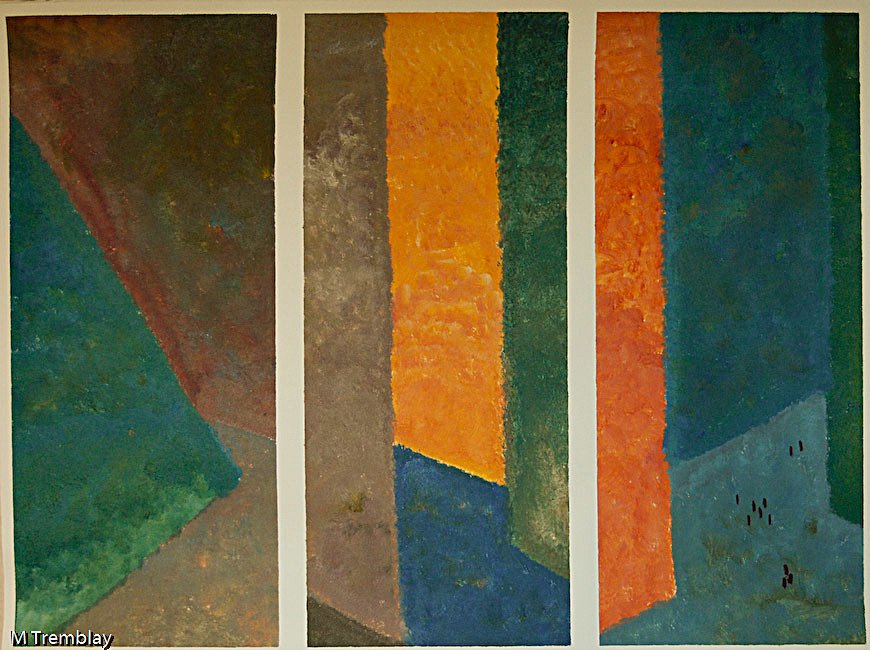
The painting is one of three I did to capture the canyons of the city between the buildings, with people as little dots. I used only three colours and just kept blending to get the full spectrum of colours for all three paintings. I loaded the brush with the first colour and continued to blend on the brush as I went, producing the range of colours you see. One of the three was used as a cover for a magazine.

Try this…
Look at the photograph of this sculptural fountain, a type of ‘steam punk’ construction.
What are the main things you notice about this.
Think of the colours, lines, textures, shadows, shapes, etc. What is the least amount of detail you think you’d need to paint this?
Now paint.
2. Light & Shadow Abstractions
Light and shadow are real building blocks of our mental construction of the external world. It is what the eye sees anyway, and from which our brain constructs what we take to be the ‘external world’.
Black or dark and white or light are often a better way to reveal texture, shadow and contrast. Working with a limited range of colour provides a powerful challenge to the traditional preferences for colour.

The black and white picture is from a studio of a friend who makes models for movies. The shadows define the shapes and provide a focused perspective on the object itself.

Perhaps a more common image is that of the grasses with their shadows. Pay attention to the horizontal shadow playing across the grasses, which contrasts with their vertical lines. It is the interplay of these two planes that creates the possibility for an abstract interpretation.

Try this…
Explore the light and dark structures in this photograph of a tree.
Find something quite ordinary around your home or garden, but look only at the light and dark bits.
3. Natural Forms Abstractions
Natural forms come from nature where we can find all sorts of ideas, patterns and images. Since nature is literally all around us, it is an accessible and ever-changing source of inspiration.

The Sloe Berries form a pattern, like connecting the dots of each berry to create patterns in themselves. The reddish stems add to the delightful colour contrast, but also present a different pattern, which you could sketch. Looking further into the photograph, there are other patterns and shapes to explore such as with the leaves in the background.

The same creative insights can be found in the photograph of the Hellebore. Look at the differences between the parts that are in-focus and those that are blurred – not everything needs to have sharp lines, but can be indistinct.
The photograph of frost and leaves is one of my favourites. The leaves were just a pile in my driveway, from raking in the Autumn, and the photograph was taken in the early morning light before the heat of the day had had a chance to melt the frost. The colours are special and only some frost and morning light, can produce them.
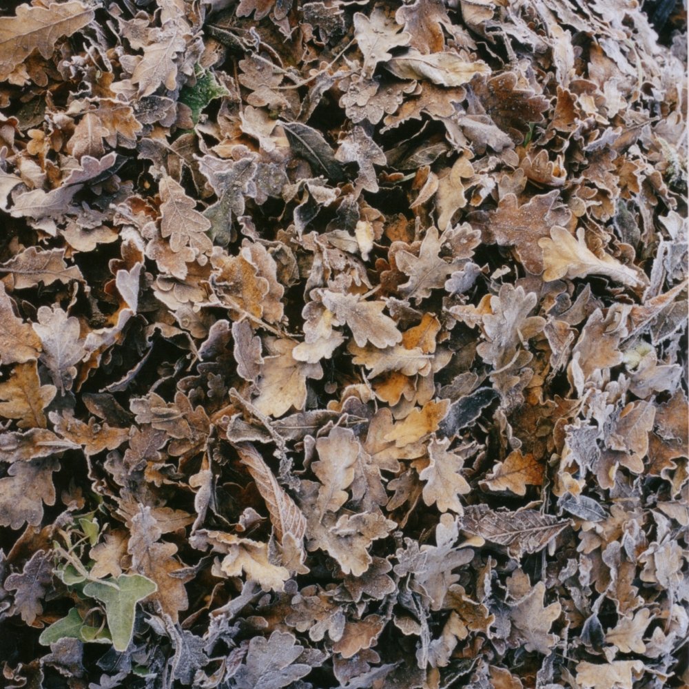
Exploring the lines of the leaves, the shadows and soft colours reveals hidden patterns, but also a hint of concentric circles as the eye moves out from the middle. What do you see?

Shadow and light come together with the rocks in Malta to produce a rich curvaceous blend. Like the other photographs, we find contours and strong shadows, plus interesting diagonal (lower left to upper right) shadowy lines.
Try this…
Look at the photograph for a few minutes – the colours, details, shapes, and so on, whatever interests you.
Put the photo aside and for 10 minutes, list all the ideas you have about it; write down what you liked about it and what you didn’t.
When you’ve done that, look over the list and identify the one observation you’ve made that in your view you’d want to see in a painting.
Now paint that image in whatever way you like.
4. Perspective Abstractions
Perspective is about challenging the way we put together what we see to interpret the world we see in terms of near/far, inside/outside. At a basic level, perspective is just converging lines, a way of telling us what is closer and what is further away. But perspective is really about carving the world into folds of meaning.
It is surprising that perspective had to be ‘discovered’ in art – one wonders what people thought they were looking at before.
Think of a dozen people viewing the same scene, each standing in a different place, with different light falling across what they see; the scene will also change over time as the sun moves, changing the scene as shadows and light close or open up vistas. Our very mood when we look at something can influence how we see it and what we see. The world is not stable; in fact it never was.
This says that efforts to capture a scene ‘accurately’ will ultimately fail for the world is constantly changing even as we look at it; as the philosophers have asked, “can you step into the same river twice?” Well, not really, as that water and that river have literally moved on.
The way our eyes are positioned on our head produce binocular vision, and that means we see the world as though we were looking at it through a letterbox — wider than higher.
The photograph of St Augustine’s Abbey in Canterbury shows the horizontal contour going from the older ruins on the left to the new buildings of the town on the right. Between the two sides of this image are many years of human history. Think about how a single letterbox image can capture that span of time but also of perspective.


Conversely, we rarely imagine looking at the world through a vertical letterbox as in the photograph of three friends on a beach (taken, by the way, with a leaky 1930’s Kodak folding camera).
Images that are strongly horizontal or vertical are more like banners. Horizontal paintings we think of as landscapes, while vertical paintings seem more like portraits. The vertical offers a completely different sense of the world and this format pushed to an extreme length as way to touch infinity.
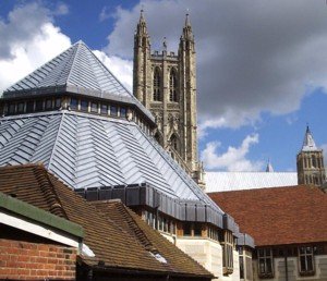
The photograph of the roofs of Canterbury Cathedral is about planes, angles and shapes. Roof-lines are interesting because of the intersecting of colours, shapes and lines.
Extracting the basic shapes, colours and folds in our three dimensional world offers a variety of abstract possibilities, but abstract paintings are often described as ‘flat’, as the artists usually try to avoid any sense of perspective, to remove any clues that the painting might be a landscape for instance, simply because it is painted wider than high. But our mind tries to make sense of the patterns in abstract paintings, and this can lead to novel interpretations of abstract works.
What this can mean in creating an abstract painting in the first place, is that perspective can be suggested, without needing to be explicit or indeed intended. This opens up new ways to create interest and explore creativity vision.
Try this…
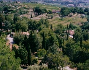
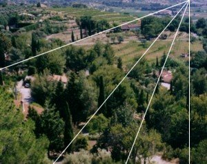
A bit of analysis shows a variety of diagonal lines created by the trees in this rather ordinary photograph.
We can see the edges of roads or fields and a sense of ‘something’ converging toward the upper right of the picture.
The image second photo is marked up to shows these lines, revealing five areas, within the photograph.
There are other options in this picture, too.
Cover the picture with circles and see what patterns emerge, or try boxes and see what you can extract.
5. Rhythm Abstractions
Rhythm lies in the music of the spheres, in the very fabric of reality. It is not just repetition, repetition, repetition. There is diversity in sameness, and sameness in diversity. This challenges our thinking about what a pattern even is, as we often associate rhythm with symmetry, whereas it is more about the repetition of change.
Here we have a rhythm of the pipes of the organ, but equally, there is the rhythm of the light coming in from the left as it slants across — you can make out one of the beams of light in the dust of this magnificent building.

The convergence of the image itself coincides with the angle of the light, as well. The colours provide additional sources of rhythmic inspiration as they follow the banding of the light from left to right.
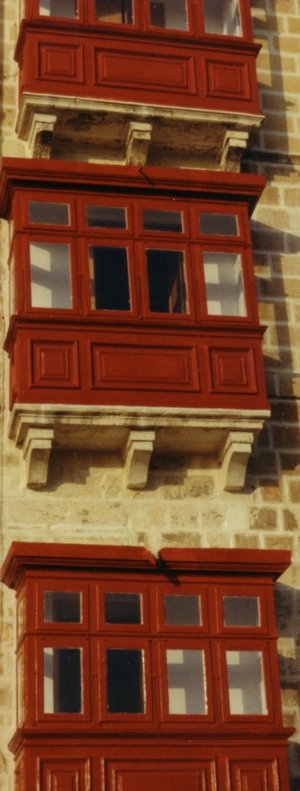
Often we see something apparently quite rhythmic, such as the red balconies on the side of a building. Each is the same, yet each is quite different. They actually don’t line up, lack precision in many aspects, yet while different, they are all red balconies. They are a far cry from the geometric precision and dull repetition of a typical apartment building. The red tells you to look at them. And what do you see?
Abstract paintings can emerge from blocks of colour, lines or boxes within boxes.

Buildings on the beach at Dungeness, Kent, UK This photograph shows a line of structures along the horizon. The blue sky and brown sand frame them. Our mind tries to find ways to make sense of this mixture of shapes. What do they have in common? What makes them different?
Do you see the triangle? There are shadows to be explored. What about the outline? Ignore the details.

This is a painting I did which interprets the buildings and activities of a steel mill, in Hamilton, Ontario, Canada.
Can you see the red hot steel going through the rolling mill? Can you see the fire coming out of the blast furnace, feel the heat? Just simple straight lines and boxes.
Try this…
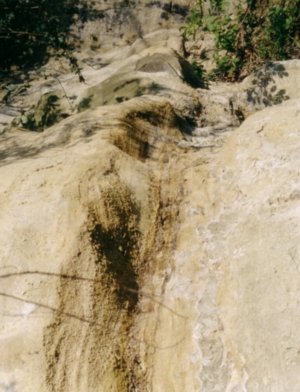
Do you see the suggestion of a stone spinal column?
What other shapes, forms, ideas can you see in the world around you?
When you are looking for inspiration where do you look? Write down a list of at least 5 sources of inspiration.
Which one would make a good painting?
6. Sky Abstractions
The canopy above our heads, that landscape up there is called the sky. Full of clouds, colours, birds, stars and memories. Always with us, ever-changing.
The sky is an interesting and variable source of colour and light. These two photographs are of the same bit of coast. There are four types of sky: morning sky, evening sky, noon day sky, night sky. In-between are constantly changing variations in the colours we see – sailors knew this: “red sky at night, sailor’s delight, red sky at morning, sailor’s take warning”.
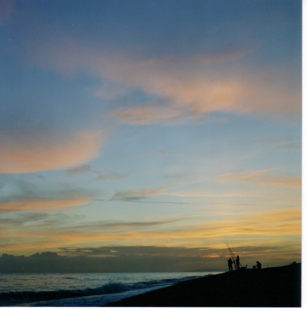

The evening sky on the left with the people fishing presents the immensity of the sky, as well as the wonderful colours that only sun, cloud, and sea can produce at this special time of day.
The picture on the right is of essentially the same view except facing more out to sea. It reveals very little detail, but revels in the richness of the colours of the early day.
Same place, different light.
In either picture, looking at the colours themselves presents an artistic opportunity for abstraction, and not just painting fields of colour, but of patterns with complex geometry.

These two photographs inspired the pair of paintings, framed together here. The one on the left is a more literal interpretation, while the one on the right is essentially the same painting only explored in a more abstract manner.
Try this…
Look at the sky at any time of the day, in whatever kind of weather. See how the tones of the sky differ from horizon to right overhead. Look at the trees and the buildings, and see how the sky is colouring them. You may have noticed how vivid the colours are when the sun is shining and the sky is dark grey as a storm approaches.
Without doing a sketch or drawing, just remember the colours and how they made you feel. Write this down in a short note to yourself. Wait a few days then reread your notes, and recall the feelings and the way the sky looked.
Now paint this. No peaking at the sky.
7. Unusual Abstractions
Creative inspiration can come from unusual places, the unfamiliar and even the bizarre! It is the extent to which we are porous, or open, to these unusual sources that can help us use virtually anything we like to be a creative abstract painter.
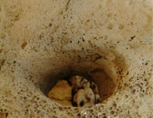
A few thousand years ago on the island of Malta, humanity built a some monoliths. Gigantia is one of the oldest lithic structures on earth and was originally seen as a place of ritual sacrifice, but historical reinterpretation suggests it had an association with birth.
This picture shows the weathered hole through which midwives passed the newly born, from the woman’s womb, into the world.

This photograph of bark, suggestive in so many ways, reveals a side to the life of trees, which we can walk past so easily. What do you see?

The studio of a model maker for the movies reveals a vivid menagerie of shapes, textures, and images.
Does this offer a fresh perspective on traditional portraiture?

The painting uses mathematics for inspiration. This painting interprets Fibonacci numbers, which form a series where the next number is the sum of the two previous ones: 0, 1, 2, 3, 5, 8, 13, and so on.
The spacing used in the painting explores the sequence through the distance between them. I have done 6 of these, all painting different relationships between the numbers.
In nature, Fibonacci numbers are found in many places, including the branching of trees, the uncurling of a fern, and the arrangement of a pine cone. So these are not just a bunch of numbers.

Try this…
This is an image of a plant produced by placing the plant directly on the glass of a scanner and scanning the image into the computer.
The only lighting is that produced by the scanner, and focus is that of the scanner lens. The final result was a complete surprise.
Surprise yourself in some way.
8. Up Close Abstractions
Getting up close to see fine detail takes us to a new world entirely. Progressively looking closer and into the world uncovers, layer by layer, amazing colours, patterns and shapes.
Looking at the details in things draws you into a particular aspect of an object that you might otherwise ignore, quite literally, you would not see it or even know it was there.
We are familiar with the extreme examples of images magnified by microscopes, where we are looking at images that are too small for the unaided eye to see, such as the photographs of the surface of pollen or a virus, or even the force fields of molecules. These are not part of our everyday experience, but when enlarged in this way, become objects of wonder in themselves. But not everything has to be that small!
Where are these close up places?

Take this window in Malta. While the lighting is quite flat, we do see the darkness behind the slats. Note the contrast between the wood and the stone wall. The almost lavender colour of the weathered wood contrasts with the soft tones of the stone. The reddish metal hinge draws the eye into the gap where we can see where the stone has fallen away and exposed more frame.

The photograph on the right shows the detail of a fig leaf. Distinct patterns and shapes are apparent. The veins divide the green expanse into small pockets as well as reveal even finer detail – can you see the polygonal repeating shapes – there is a resemblance to a road network or the suburbs.
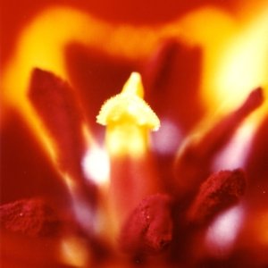
The photograph of the inside of a tulip was taken with special close-up camera equipment, and involved removing one of the petals and peaking inside. You can see the powerful impact of the light coming through the petals – the picture was taken almost directly into the sun and the colours are not manipulated.
These are stunning colours and the shapes are provocative. The specific texture of the stamens is apparent with ever such slight highlighting.
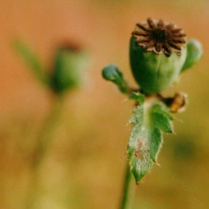
While poppy pods are not particularly small or hard to see, there is interesting fine detail worth looking at. The textures around the crown of the pod have a lovely tonality. The shadow on the foreground pod shows the fine striations on the pod itself.
What also adds interest is the blurring of the background, which provides hints at another pod. Like an echo, perhaps?

Garden reeds If you look closely at reeds in a pond, you’ll see these fruiting growths, forming wonderful twisted structures, which contrast with the firm lines of the reeds themselves. These fruits can be examined in much greater detail, like the tulip.
Note also the vertical lines of the reeds, contrasting with the angular shapes of the flowers. This could become an interesting painting.
The painting below explores a copper pot, the light and shadows around it, bouncing off the copper, and the discolouration from its age. Rather than paint the copper pot itself, consider looking at the light and shadows instead.


Try this…
Look at this close-up photograph of part of a plant. What do you see?
Do you think there is a story being told?
Paint what you think is happening?
9. Whole Images Abstractions
Some things we look seem complete in and of themselves. We look at them as a whole, and draw inspiration from that completeness. Such images influence our creative processes as well as the desire to produce work with a strong and visually integrated presence.

This is a metal mask. It is perhaps 3m high. It offers a powerful inspiration for a series of mask-like interpretations. Looking more closely, you can see the metal strips that have been used to make it. It is found in Canterbury, somewhat off the main street, which is a shame as it has tremendous street presence.

The photograph of Calla lilies captures all of them together, showing the lines of the stems and dark green foliage against the soft background (a white wall in light shadow).

Plants in natural settings have a natural composition, while in planned settings such as parks are structured compositions reflecting the design assumptions of the garden designers. Sometimes nature is better at this, as people can get it wrong, and nature can surprise.
The leaf, in the photograph, was found (not placed) in the metal link fence, and the colours of the background left to blur. This photo is a moment, the immobility of the fence, and the leave, fallen from a tree, captured. Only the wind can set it free as the wind probably put it there in the first place.
This inspired the painting “World’s End”, an interpretation of the future of the world.


When photographing flowers and natural forms, it is common to use a black/dark background in order to display the detail of the flower/plant. The dark background reveals more about how the light plays off the parts of the plant.
The blurred background could inspire some abstract painting, too.
Try this…
Take a couple of minutes to think of two or three issues that concern you, such as in sports, politics, etc.
Next, look at the photograph. It shows a section of railing at an historic site (in France). Note the lines and curves and patterns of the lichen on the stone. Create a painting that links one of the issues on your list to the shapes in the photo.
